DAVID ATLANTA MAGAZINE
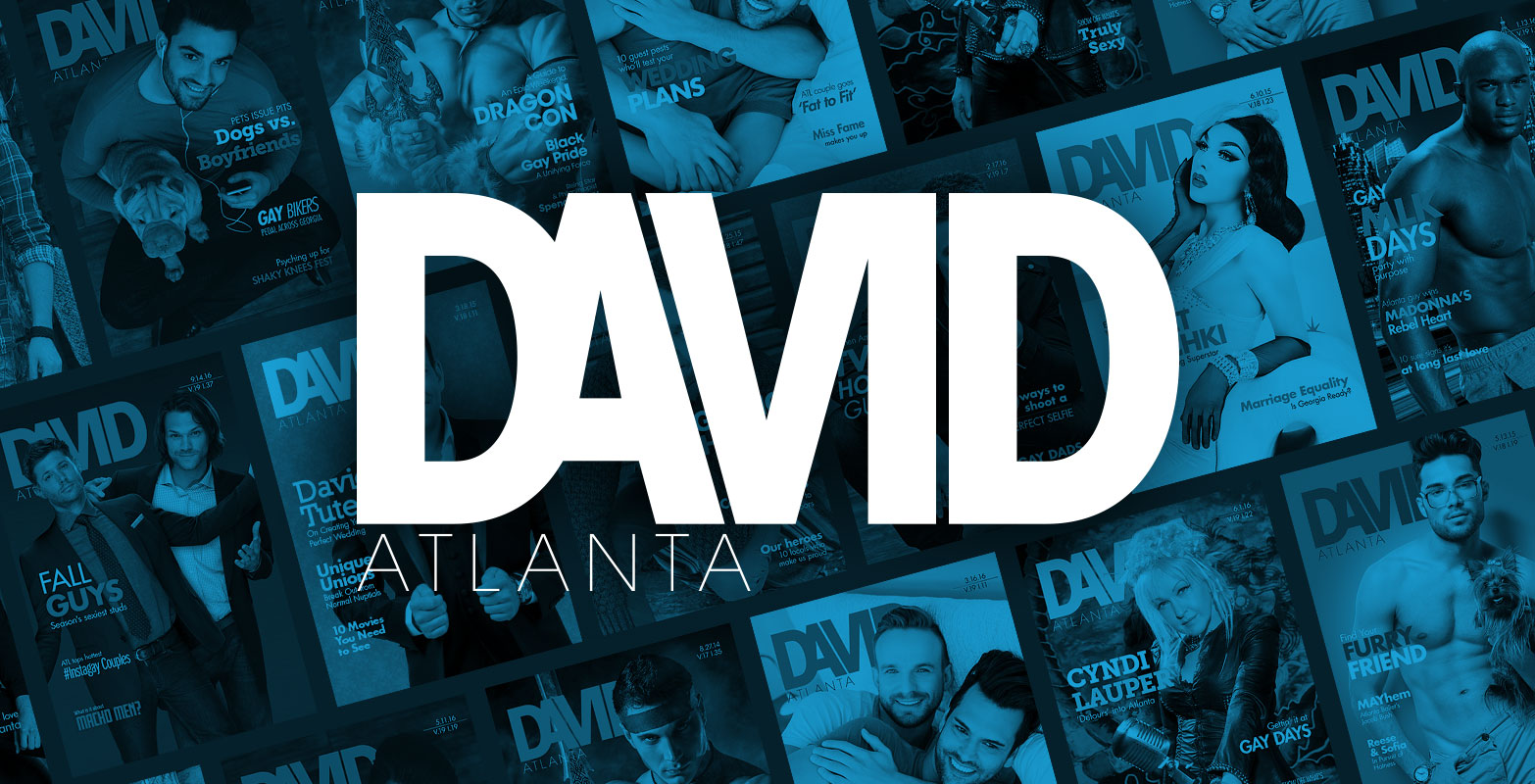
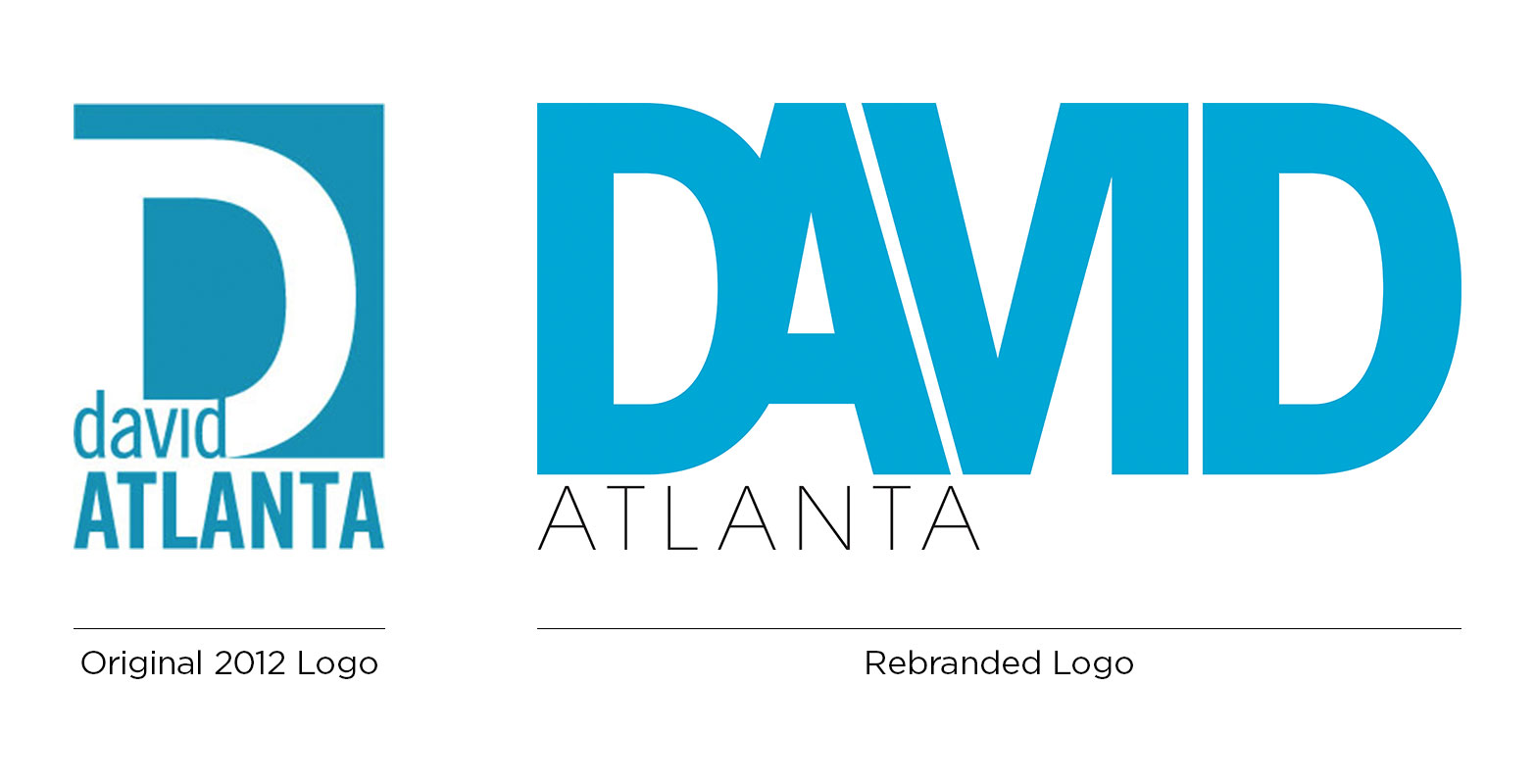
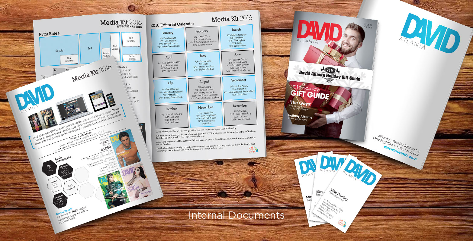
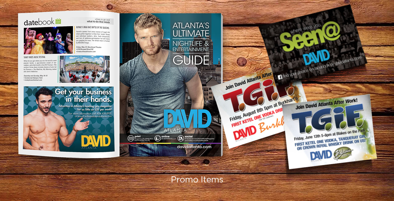
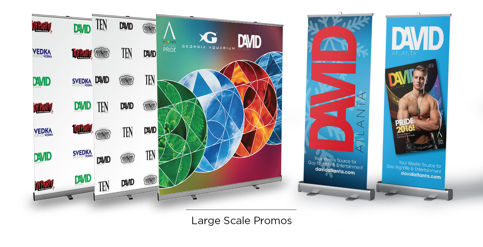
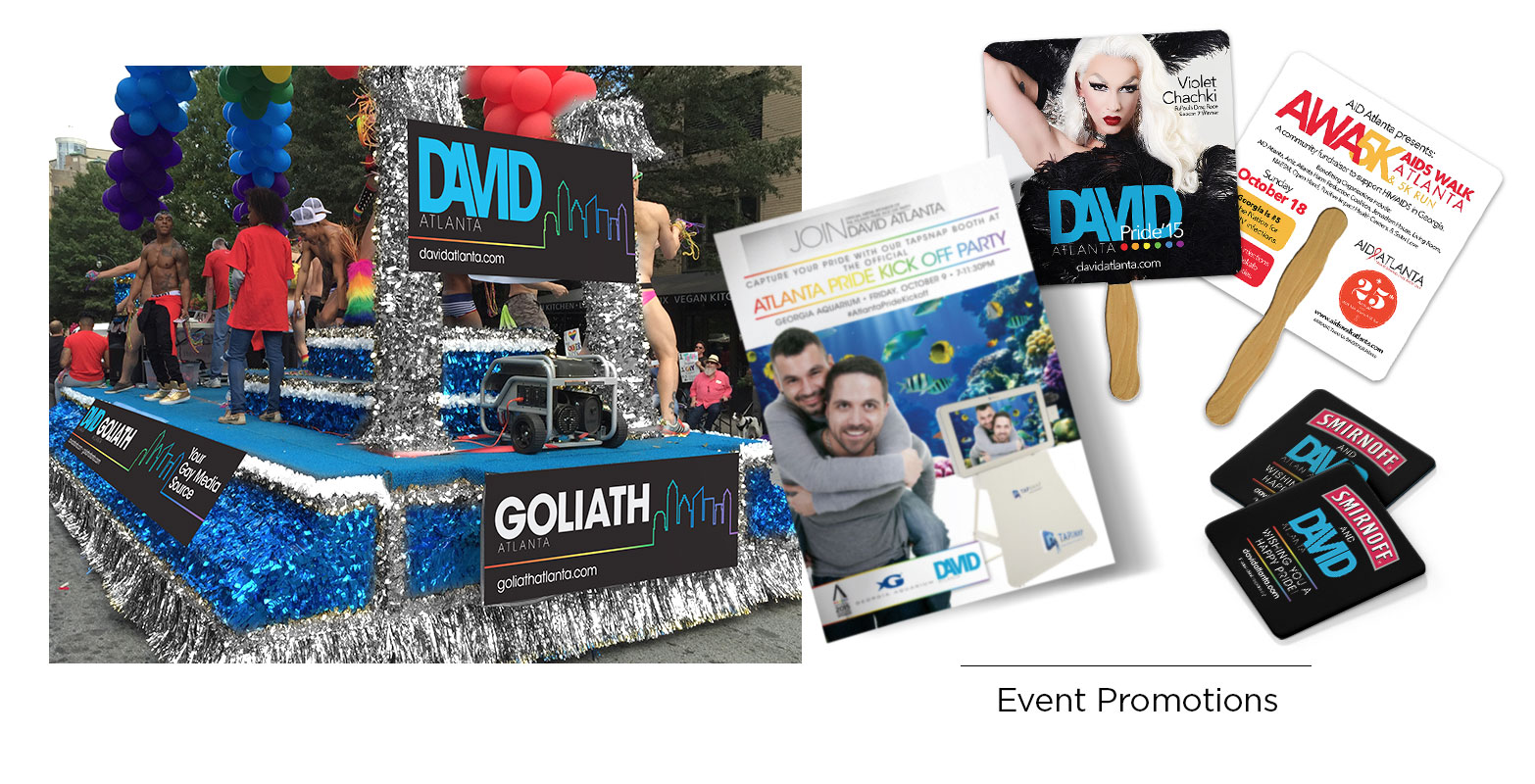
As the Art Director at David Atlanta Magazine, the longest running and only weekly LGBTQ+ publication in Atlanta, I was tasked with rebranding and maintaining that brand across multiple applications: internally and externally.
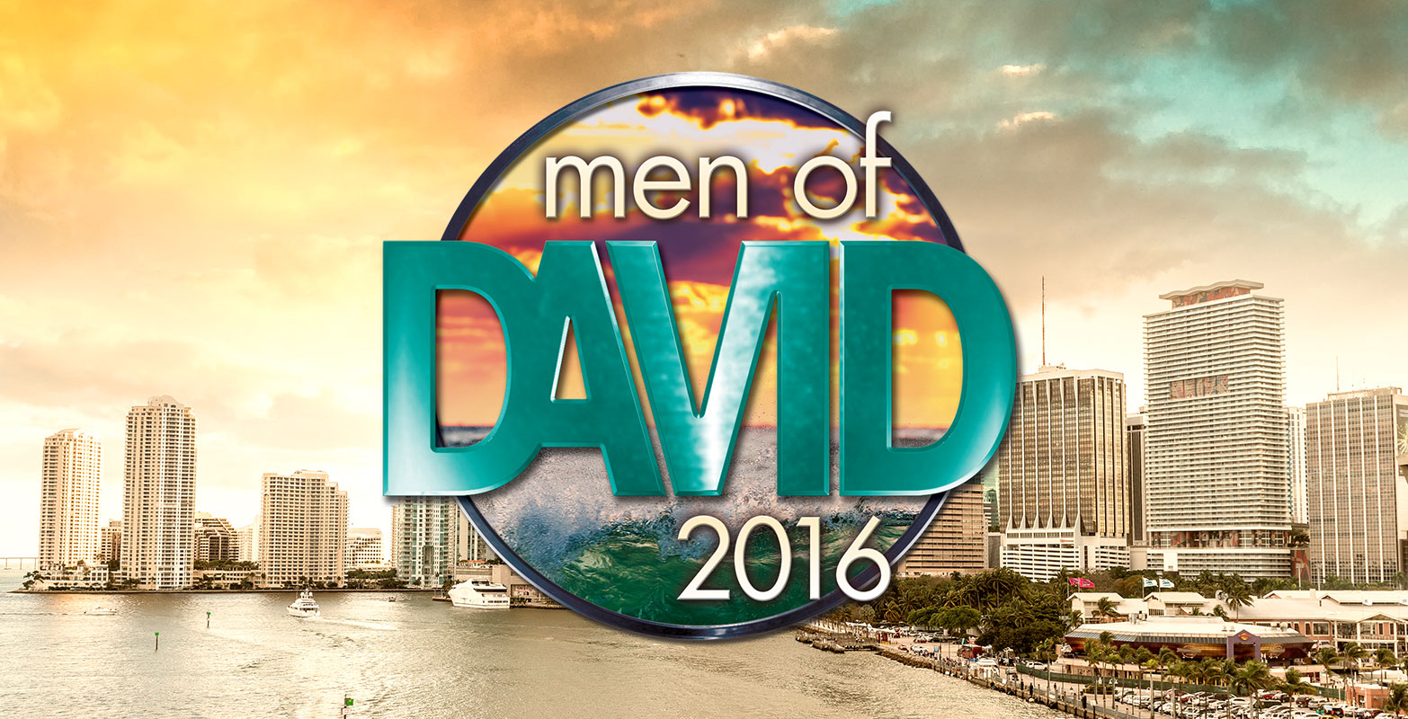
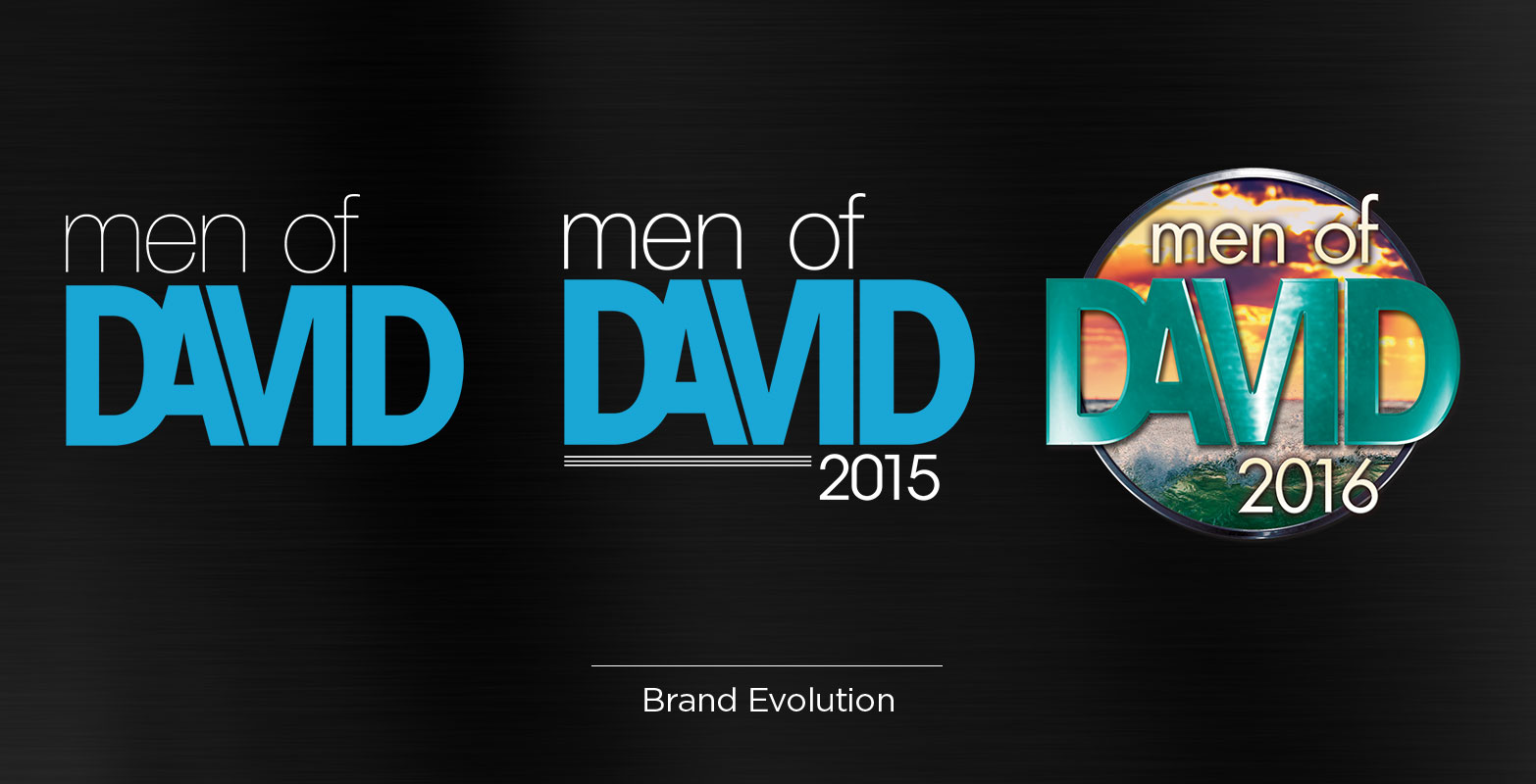
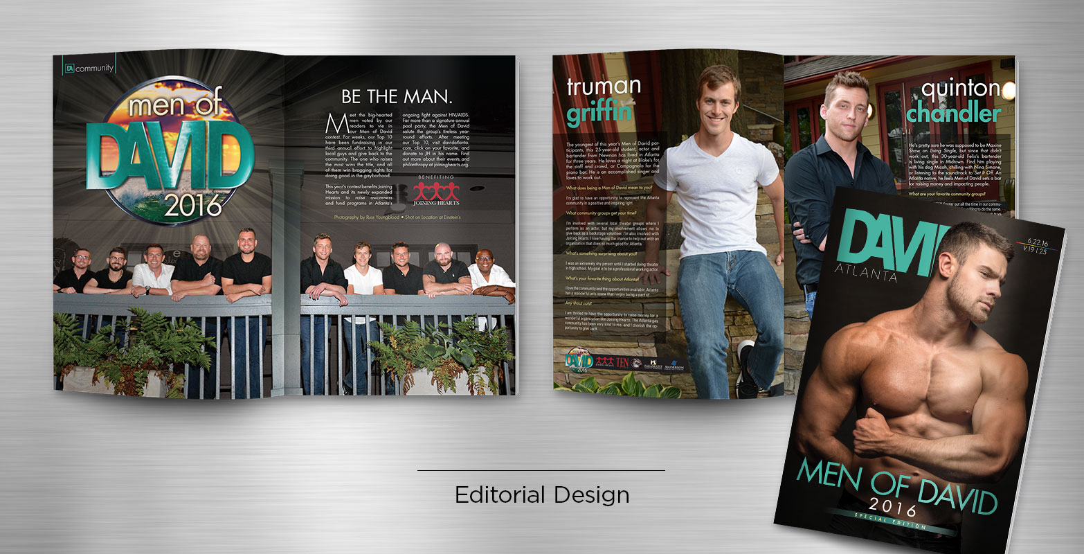
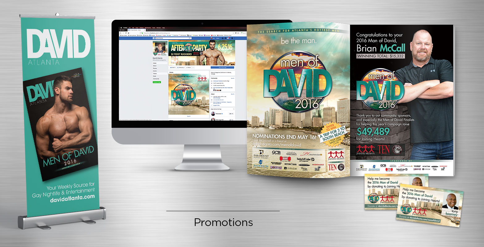
MEN OF DAVID COMPETITION
As a throwback to a long history of featuring local cover models, this charitable competition raised funds for multiple local charities. Contestants were charged with collecting donations with hopes of claiming a prize package and the title of that year’s Man of David.
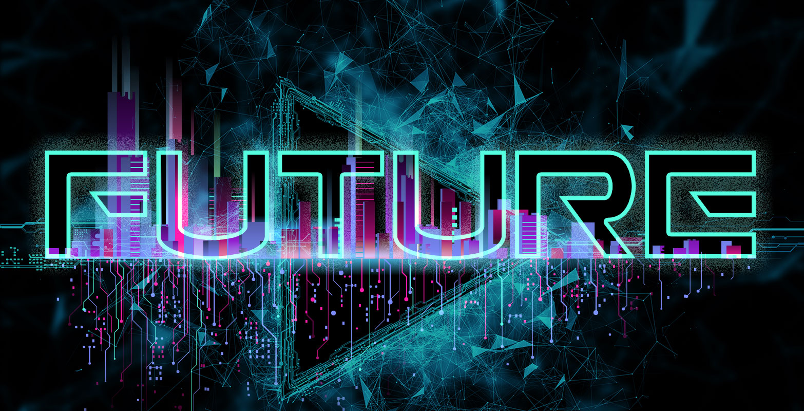
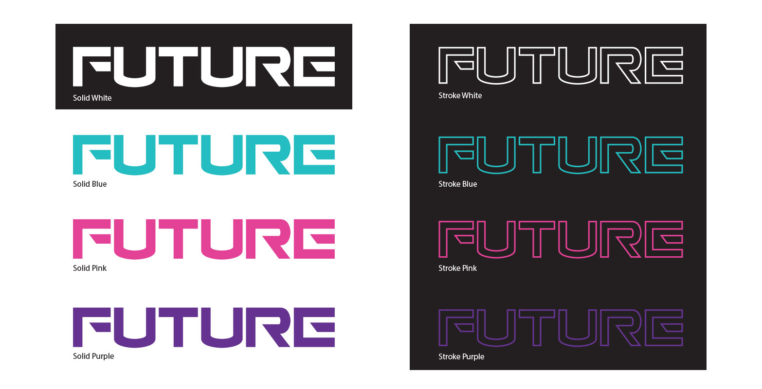
FUTURE NIGHTCLUB
This brand new nightclub located at Underground Atlanta required a simple typographic logo design. A vibrant florescent color palette and a clean, angular typeface were used to invoke a futuristic world of neon lights and electronic music.
GOLIATH ATLANTA MAGAZINE
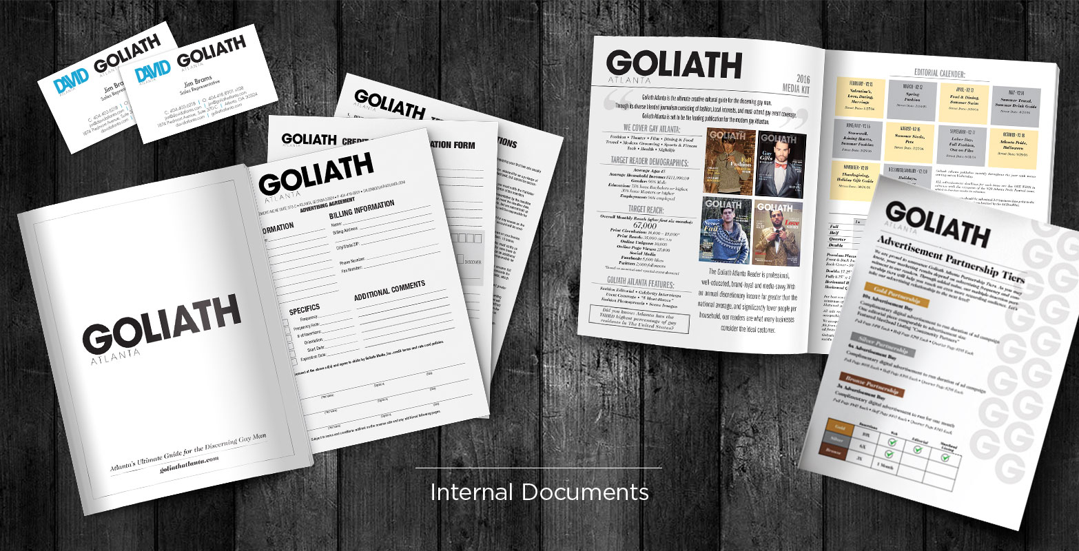
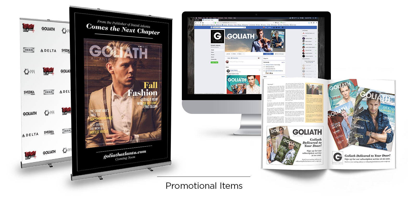
While David covered arts, entertainment, and nightlife its new monthly sister publication, Goliath Atlanta Magazine, focused on fashion and lifestyle. A less whimsical, more refined identity that remained true to its roots was required.
ORIGINALLY YOU FOUNDATION
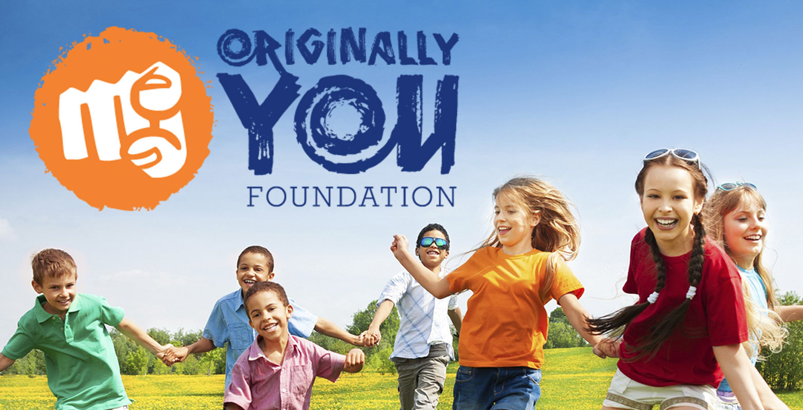
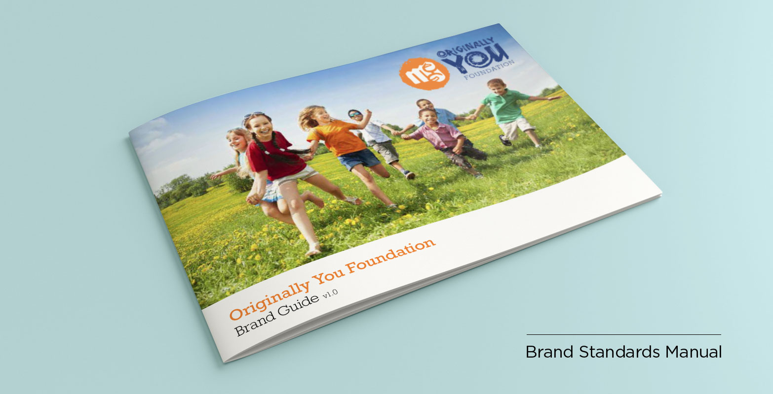
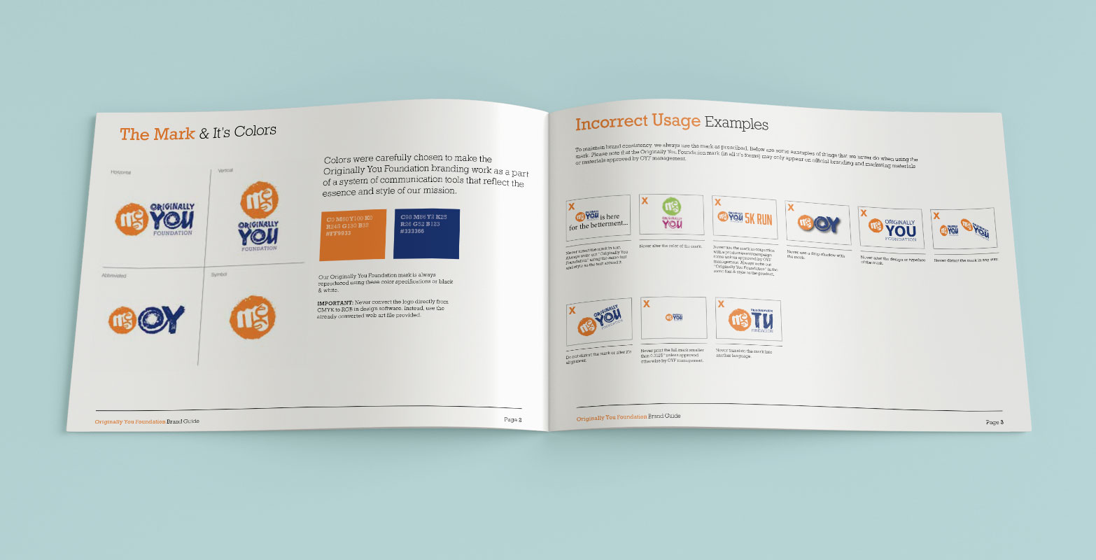
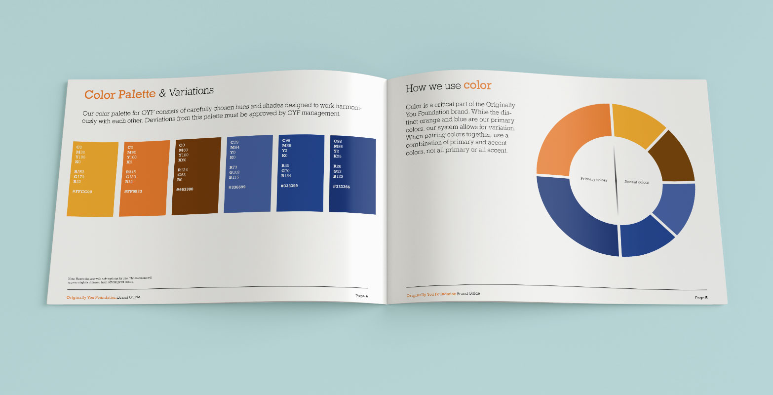
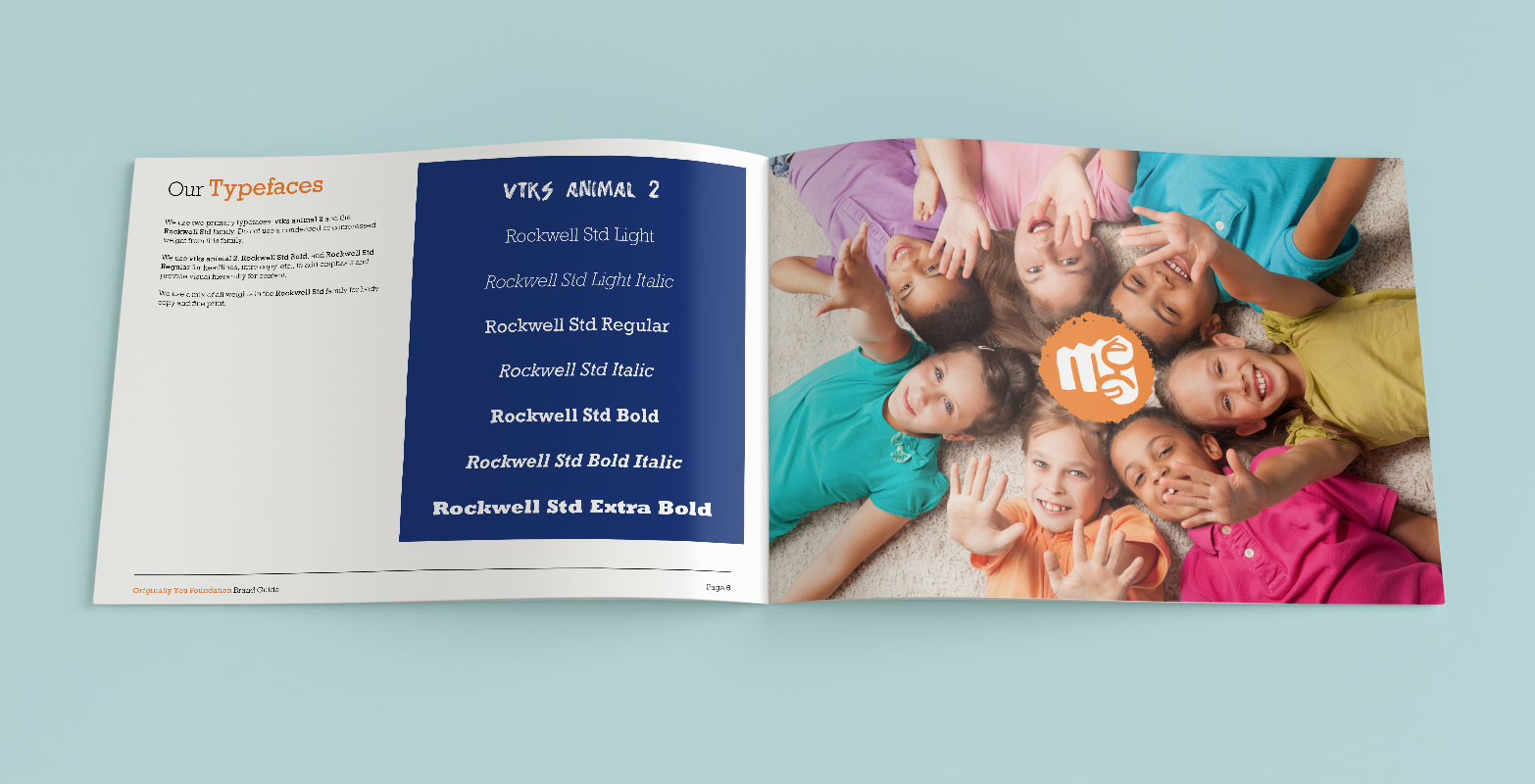
A full identity package was needed for this new non-profit that fought against bullying and encouraged children to embrace their differences. Colors, typefaces, and imagery were carefully chosen to appeal to children and parents alike.
